institute
A Digital Presence That Sets a Standard in Landscape Industry
OVERVIEW
Challenge
The Landscape Institute (LI) is the charted body for the landscape profession, aiming to protect, conserve and enhance the natural and built environment through the work of their members.
As the need for Landscape Professionals is rising day to day, LI approached us to help them envision a new career, a marketing-oriented website that would encourage more students into choosing a career in the landscape.
The new website needed to provide clear user pathways for different landscape careers, while still giving a compelling overview of the landscape profession.

OUR APPROACH:
STRATEGY
Building a Clear Pathway to Landscape Career
To understand how to organize and shape the website we needed to understand the users who will use it. As the career paths are divided into five main fields - landscape architects, managers, planners, scientists, and urban designers, our goal was to get to know each of the professions and the individuals who work in them.
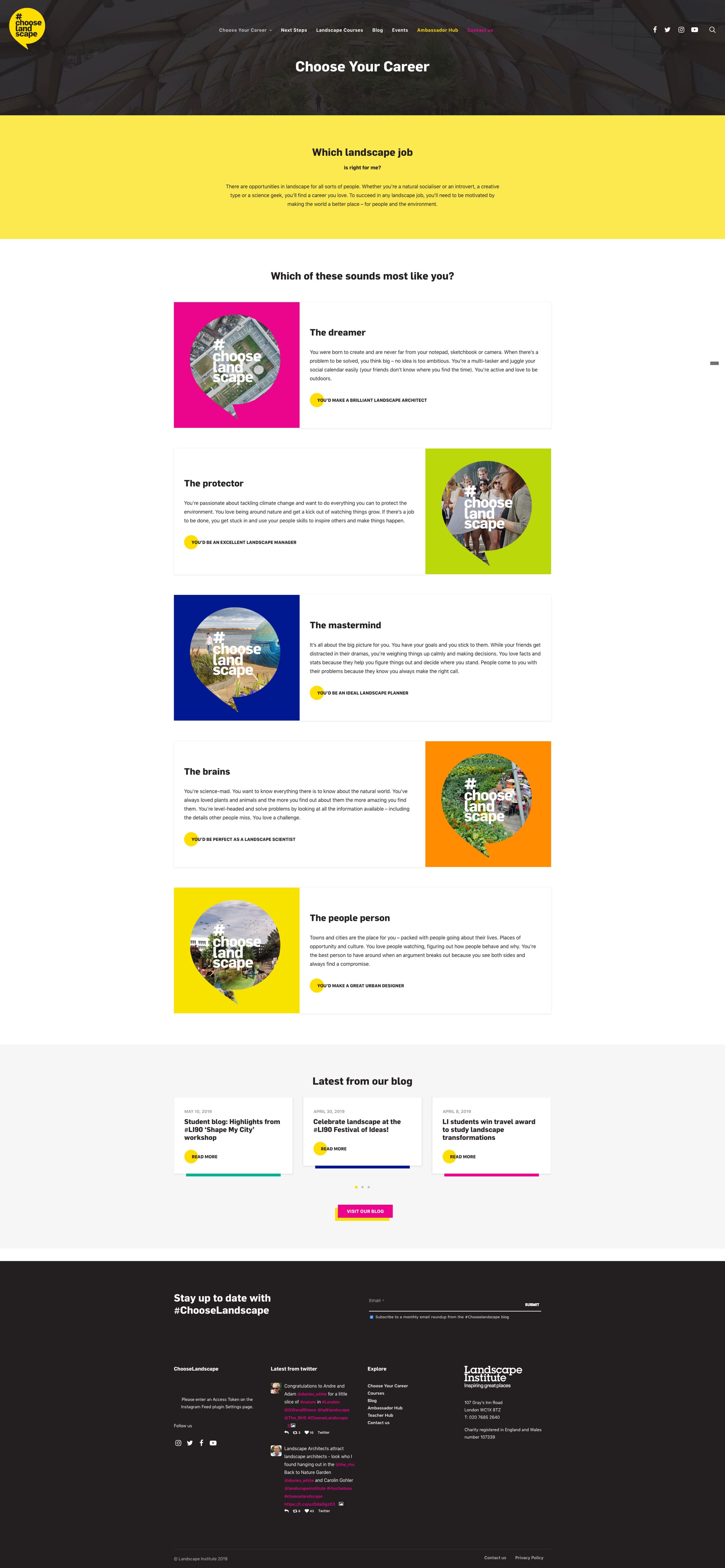
We decided to present each profession like a small sub-brand so that once the user identifies with the profession it will create a strong visual bond. Thus, each profession is highlighted with the brand logo, one of the vibrant brand colors and an image that showcases the profession.
Research of the industry and targeted audience ensured that we define a clear user pathway and an organized website that is creative, engaging, and easy to navigate. The clearly defined pathways were geared towards helping users quickly identify the desired profession and take action.



our approach: design & ux
A User-oriented, Creative Website
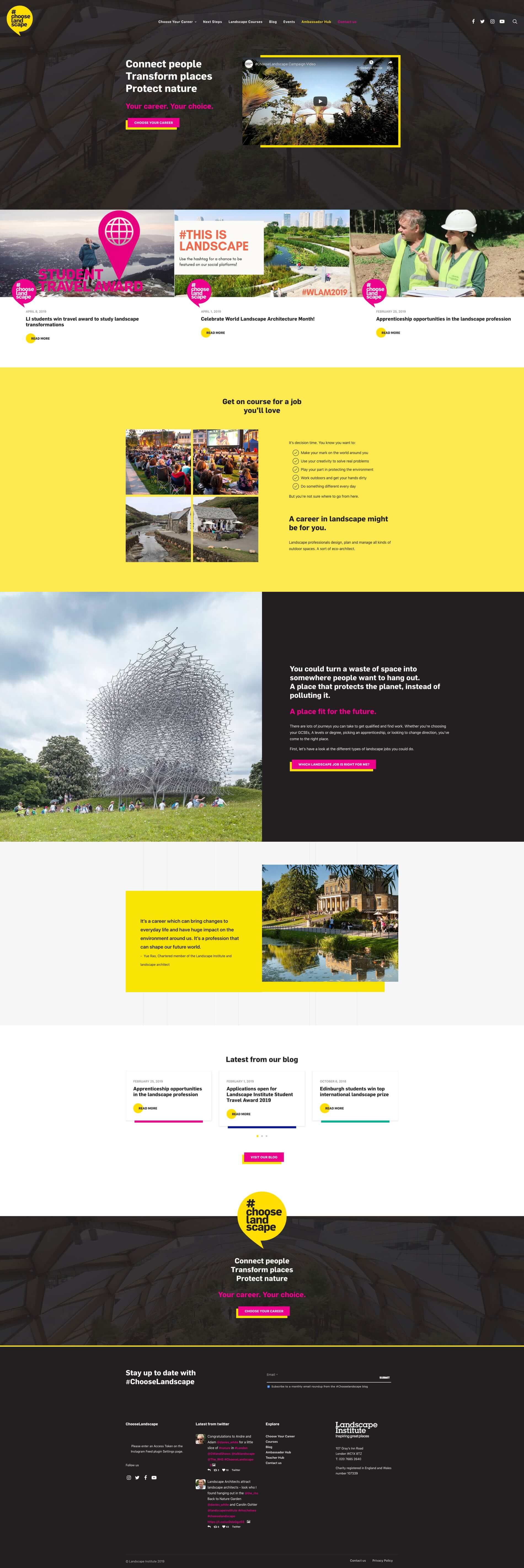
If the user were to choose the Landscape website, it would bring the best of landscape profession up first, showcasing a campaign video explaining what the profession is all about and testimonials from landscape professionals, giving the user a fast first glance into the landscape profession.
Introduction to Landscape Profession
From the homepage to the entire website, everything is focused on providing users with information on the landscape profession and different career paths they can take.
OUR APPROACH:
DESIGN & UX
Scalable and Easy to Use on Any Screen Size
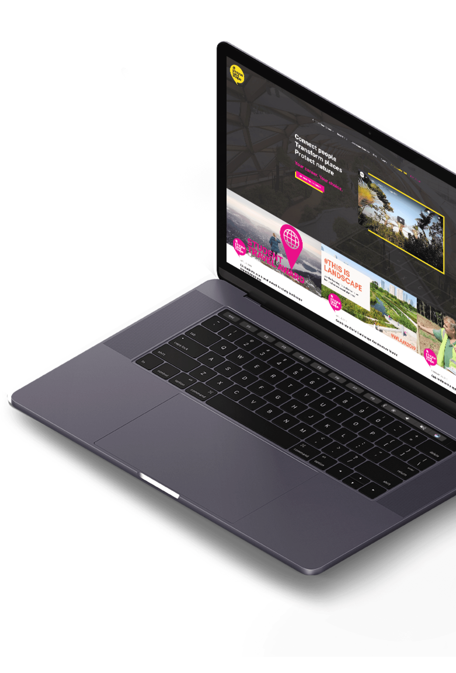
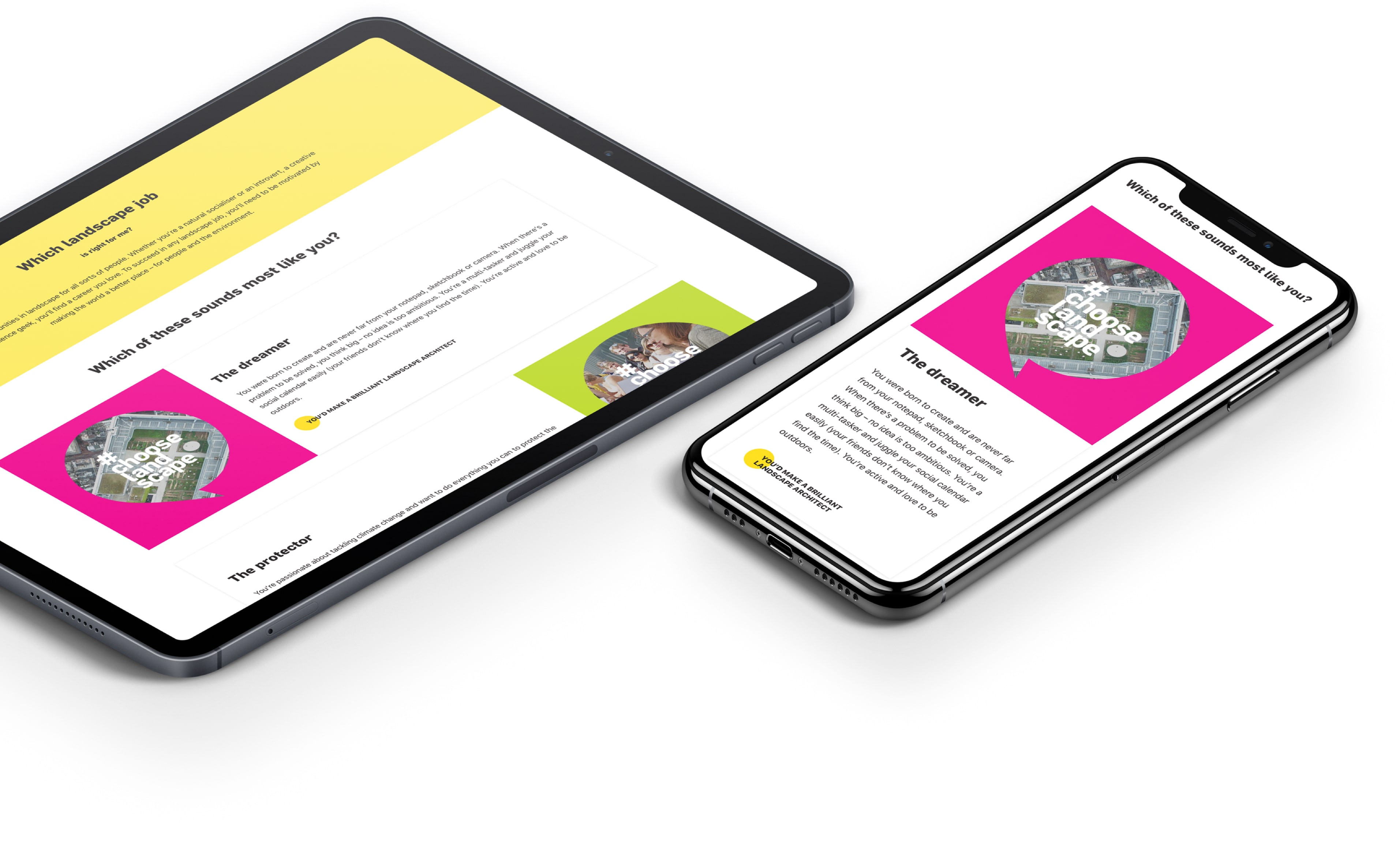
To ensure a seamless experience on virtually any screen size and device, we also designed the experience with mobile devices in mind.
All content is optimized to provide users fast and quick access to the information they seek while continuing to provide a creative and engaging experience.
Giving Each Profession A Personality
To make career choice easier for users, each landscape profession is given a personality to which users can relate to, while featuring image and brand logotype to create a strong visual connection.
OUR APPROACH:
IMPLEMENTATION
Encouraging Users to Take Action
The website was implemented on the WordPress platform, giving the Landscape Institute team an easy framework for marketing. This decision made adding new content in forms of new courses, blog posts, and events simple for the Landscape Institute to navigate.
One of the crucial parts of the website was giving users the option to engage with different content and encouraging them to take a step forward in entering a landscaping career.
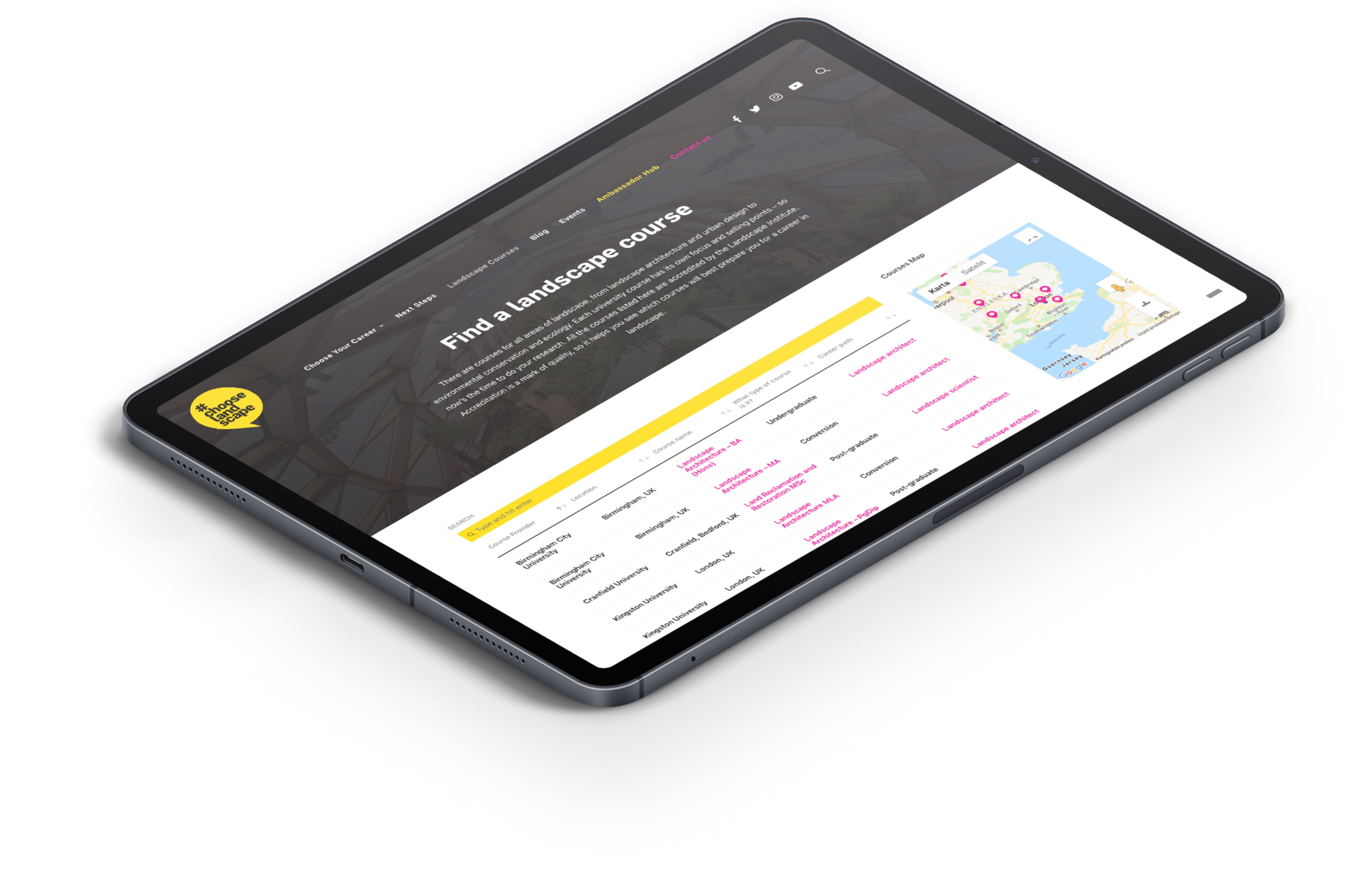
To make that possible, we created a showcase of landscape courses available in the United Kingdom, organized by the course provider, course type and a career path it is meant for. Each course is also linked to the landing page that provides information about the specific career path.

"We engaged Northwest to design a new careers campaign website, #ChooseLandscape. Not only did they turn it around in record time, providing great feedback and advice along the way, but what they delivered has been mentioned in industry press as an examplar of how to do similar websites in our sector"
Amina Waters, Head of marketing at Landscape Institute
View Case Study