gmbh
Reimagining Financial Treasury Management
OVERVIEW
Challenge
TIPCO Treasury and Technology GmbH provides the best-in-class Treasury Information Platform (TIP) for some of the leading companies in Europe across various industries, including Lufthansa, Siemens, Porsche Holding, and others.
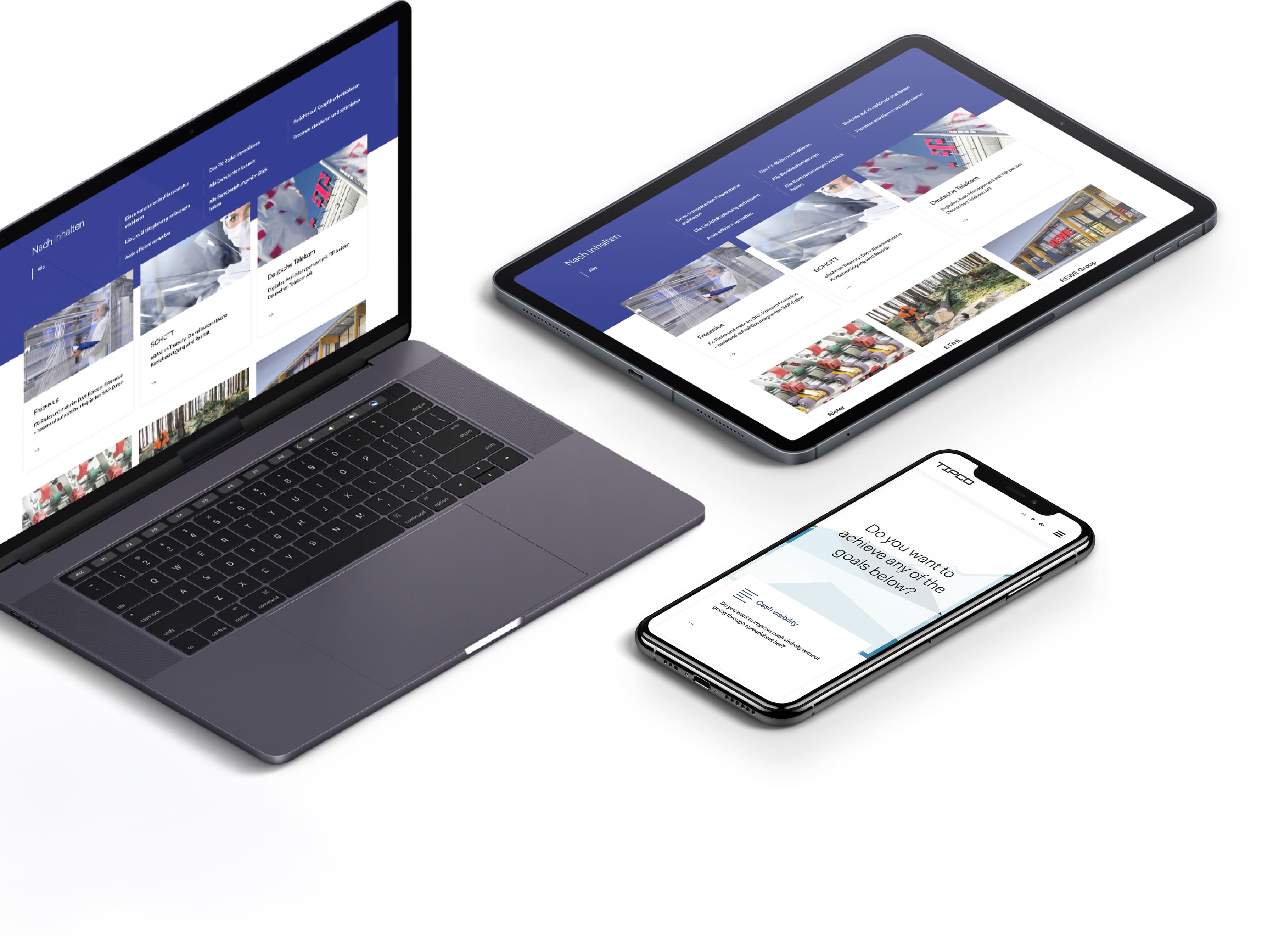
TIPCO team reached out to us to help them revamp their old website to a provide better user experience in terms of better information structure, enhanced navigation, and to create an overall more informative website for their business users.
We worked closely with the TIPCO marketing team to design a website that showcases the abilities of their financial treasury software, highlighting the benefits it can bring to their user’s business.
OUR APPROACH:
design & ux
Conducting a User Experience Audit
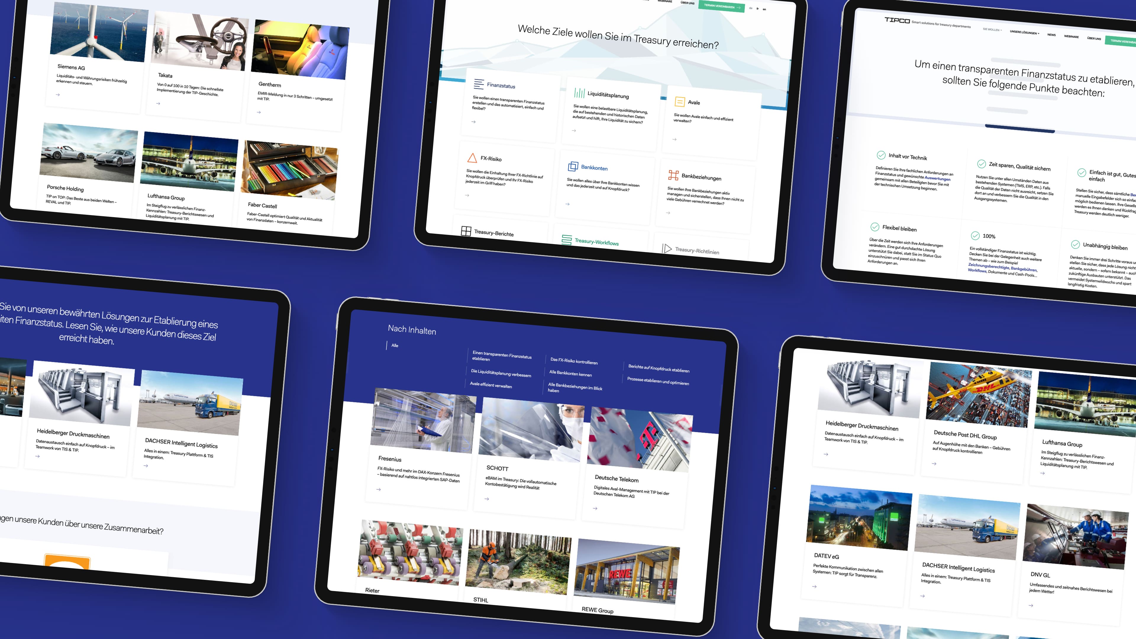
In order to understand the background of the problem and create a design strategy that will drive results, we conducted a user experience audit.
We wanted to identify the key pain points of users and examine their behavior when using the website. During our investigation, we identified problems in the website information structure and hierarchy, information flows, navigation and observed negative experiences when browsing on mobile.
We worked closely with the TIPCO team to create new a information architecture and use flows to improve the user experience and highlight the benefits that their financial software brings to business users.
OUR APPROACH:
design & ux
Design Objectives
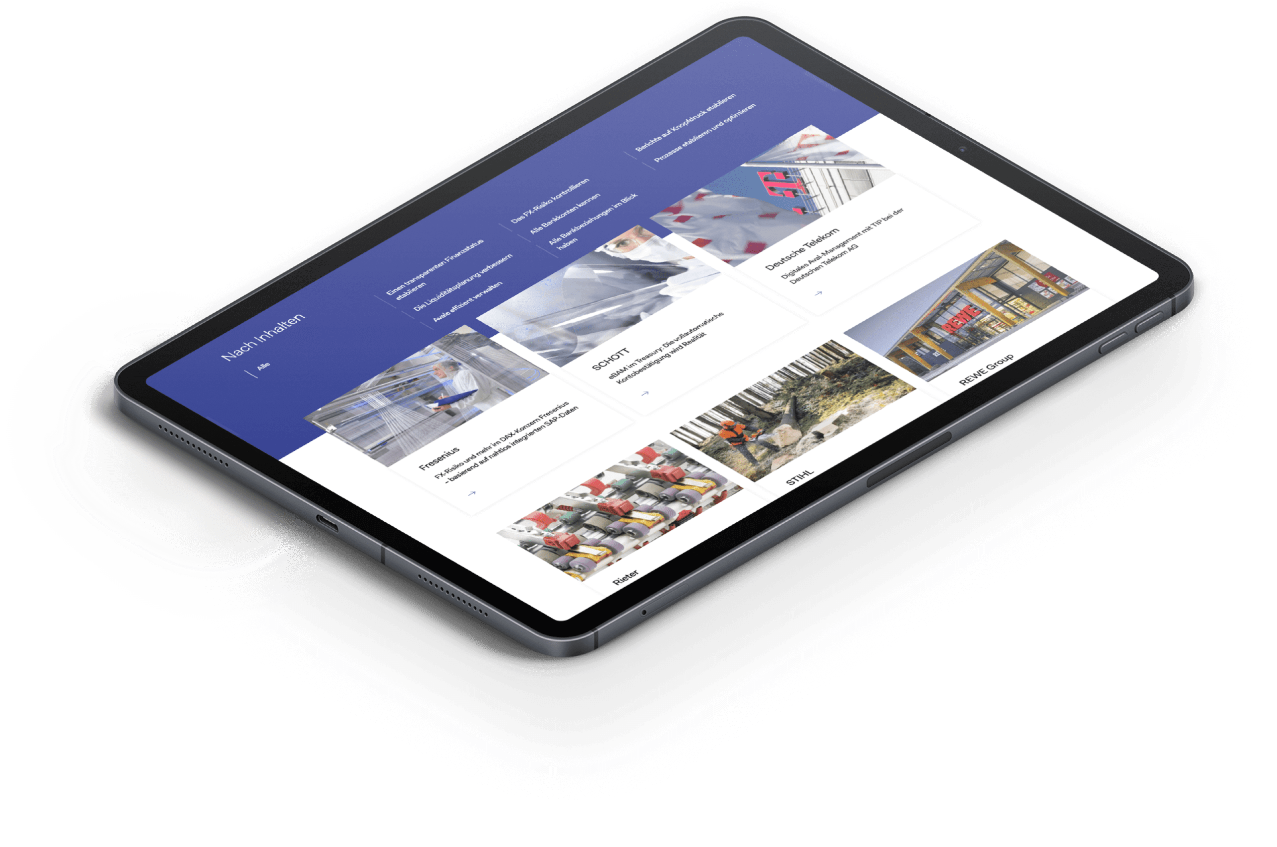
One of the goals of the website was to show TIPCO's expertise and impressive clients they work with, like Porsche Holding, Lufthansa, Stihl, and others, to bring credibility and show expertise.
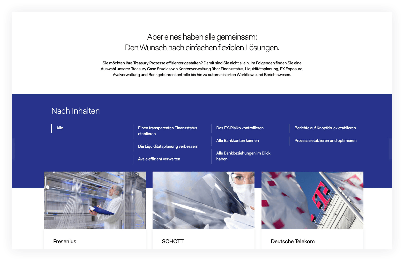
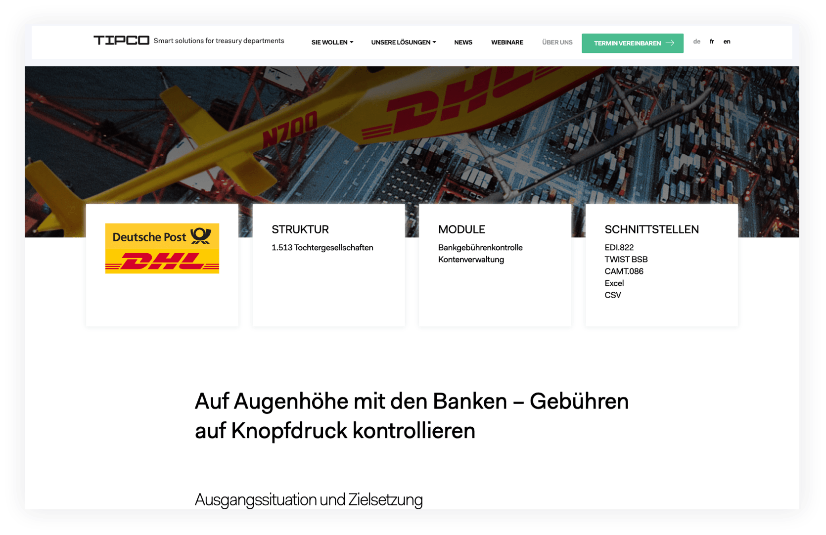
We decided to make their case study a focal point of the website, featuring great images that capture user attention and engages them in discovering the benefits these companies have from using the software.
Custom icons provided by the TIPCO marketing team were used to present each module of their financial software. Each module was also captured with the description in terms of benefits it brings to the business user.
A Flexible Design System
TIPCO contains several pages for their financial Treasury Information Platform. Each page is unique but remains a part of the greater whole. We created a flexible design system to create a connected user experience.

Focusing on Business Users
TIPCO offers their Treasury Information Platform to business clients, so each part of the website is focused on highlighting the benefits companies from various industries receive.
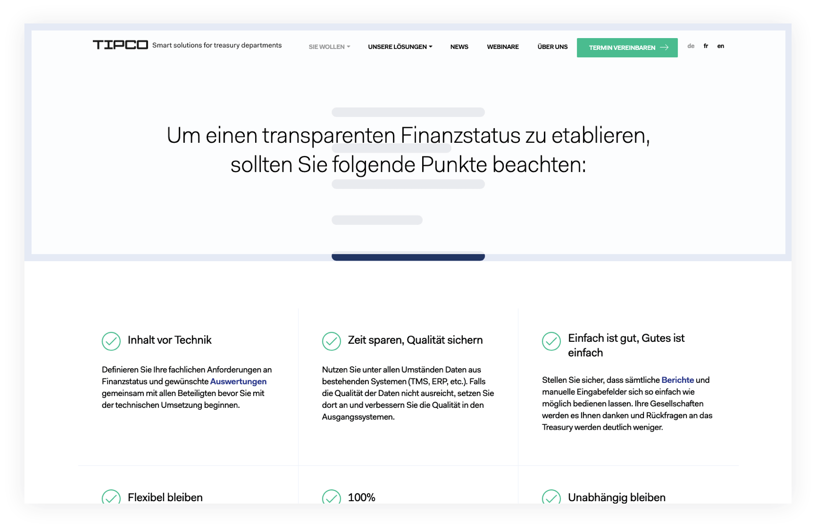
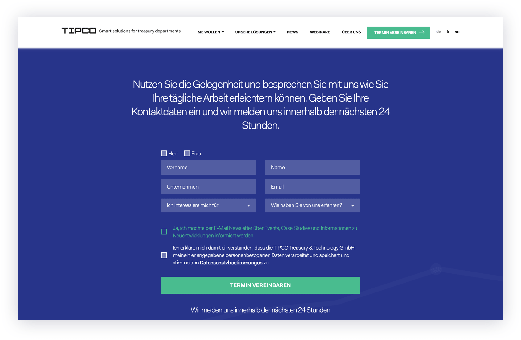
Easy to Schedule a Demo
OUR APPROACH:
implementation
Shaping Pixels Into Engaging Online Experience
To make editing content easier for the TIPCO marketing team, we choose to utilize a WordPress platform and powered it with Advanced Custom Fields.
This created a system that was simple to build on, enabling the TIPCO marketing team to quickly add and edit the content of the website.
As with any website redesign project, we diligently migrated and audited legacy content like blog posts. Due to the very short content of blog posts, we chose to display them like an accordion block, giving users a quick and easy way to discover new content.
We took special care to optimize content for any device and screen size to provide a seamless user experience.
